 |
|||||||||||
|
|
|||||||||||
|
Feature Articles: ICT Design Center: Design and Assessment Work Vol. 9, No. 9, pp. 16–21, Sept. 2011. https://doi.org/10.53829/ntr201109fa4 Design Guidelines for Installation Manuals for NovicesAbstractThis article describes some case studies of designing the paper manual for replacing an Internet router for a home network. Constructing a method for designing easy-to-understand paper manuals for novices is one of the most important tasks at the ICT Design Center. We show how we improved the manual, which is now being distributed to actual users
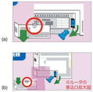
1. IntroductionWith a greater variety of home appliances being connected to the network, consumers are faced with the daunting task of setting them all up by themselves [1]. Therefore, simplifying this task and providing easy-to-understand manuals to users, especially novice users, are essential tasks for the NTT Group. Since most manuals are currently paper-based ones, this was our focus. The ICT Design Center has been helping companies in the NTT Group to improve router setup manuals in order to develop guidelines for the creation of user-friendly manuals (ICT: information and communications technology). We have conducted many usability studies in which we gave different setup manuals to novices and observed their actions. Unless we exercise considerable thought and ingenuity in designing the manuals, users are sure to run into some trouble. For example, they are commonly tripped up when the equipment illustrated in the manual does not look exactly the same as the equipment they actually have in front of them. They are also troubled by technical jargon that they cannot understand. Furthermore, users sometimes feel overwhelmed and give up before they even start, or they may plow through the manual and end up skipping over some key information. On the basis of these usability studies, we have made many incremental design improvements and have accumulated essential techniques to reduce the trouble that would otherwise plague users. We have focused on designing a one-sheet manual that places all crucial information on a single piece of paper to simplify the setup. Our challenge was to construct a method for designing easy-to-under paper manuals for novices. 2. Case study2.1 Device replacement manualIn this article, we consider the specific example of an improved manual for Internet router replacement: replacing an old router with a new one when the old router fails. One might assume that replacing a router would be fairly simple, but in fact all kinds of problems can occur if the manual is poorly designed. For example, how to remove the cover of the connector compartment on the side of the new router and remove the protective shipping cap is illustrated in Fig. 1(a). However, we observed that a surprisingly large number of users could not figure out where the router's cover was. We believe that this was because the figure shows only a closeup view of the location. Our tests showed that users did not experience the same confusion with the improved figure (larger view of the router), shown in Fig. 1(b).
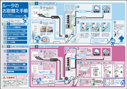
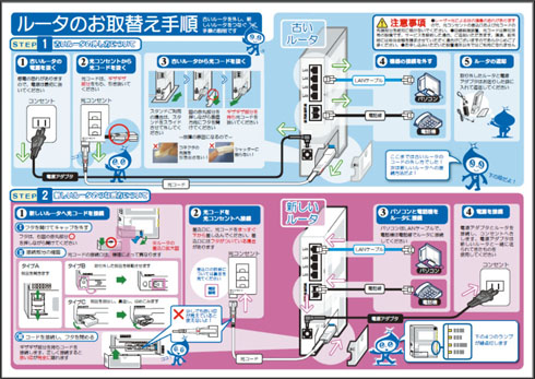
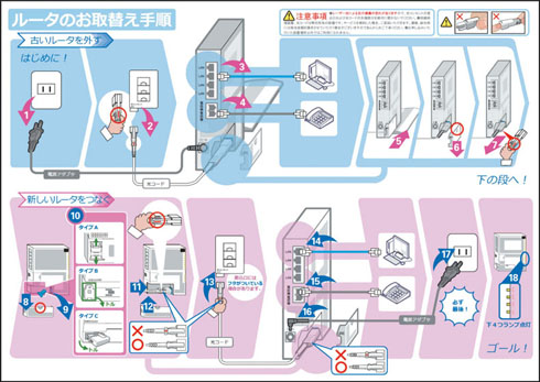
Similarly, we found that just using a closeup view of the socket area to illustrate how to connect the router left some users confused. They made mistakes simply because they could not figure out what equipment should be connected to what. In this case, just showing the two pieces of equipment to be connected and the cable together in one figure (telephone, router, and modular cable) eliminated most of the confusion. These results led us to an important insight and design guideline: namely, that when inserting figures in the manual, provide an overview that includes the whole configuration. In this way, we sought to derive general design guidelines from various test cases. 2.2 Two design conceptsBesides the modifications and design fine-tuning already described, we have also conducted studies in which we developed installation manuals according to different design concepts and then compared how users responded to them [2]. The router replacement manuals shown in Figs. 2 and 3 were developed according to two different design concepts. The text and figures are identical in both manuals: the difference is the layout of this information. Both manuals are also divided vertically into two parts, with the top half showing how to remove the old router and the bottom half showing how to install the new router.
While both layouts were designed on the basis of the abovementioned concept of a whole-configuration overview, the duplicated-layout (Fig. 2) was designed so that the subfigures of all connected equipment—e.g., electrical outlet, telephone, and personal computer—are arranged in close proximity around the router. This lets the user see at a glance what equipment the router is connected to. Another feature of this layout is that it reflects the spatial locations of the components. For example, the power connector occupies the top-left corner in both panels (upper panel: old router; lower panel: new router), but the actions for reconnecting the power cord to the new router run from right to left. On the other hand, in the ordered-layout manual (Fig. 3), the procedures for both unplugging cables from the old router and reconnecting them to the new router run from left to right, but the spatial locations of components in the upper and lower panels are reversed. This sequential manual is designed to get the user to perform the steps sequentially from left to right. 2.3 Comparison of the two design conceptsWe conducted an experiment in which we asked subjects to replace a router using the two manual types (duplicated-layout manual and ordered-layout manual), and we observed how they went about it. The subjects were divided into two groups of seven people: one group for each manual type. Although both the manuals instructed users to completely disconnect the old router first and then connect the new router, we found that some of the subjects using the duplicated-layout manual went back and forth between steps to disconnect the old router and install the new router with total disregard for the actual sequence of steps. For example, some of the users unplugged the power cord from the old router and plugged it directly into the new router. They next pulled out the local area network (LAN) cable from the old router and plugged it directly into the new router. We assume that this behavior was motivated by an awareness of the overall objective of the task—that is, unplugging the old router and plugging the cables into the new router—and the users modified the steps in the interest of completing the task more efficiently. In other words, this behavior conforms to the nature of the duplicated-layout manual: easily anticipating the overall task that needs to be done. Note that none of the subjects who used the ordered-layout manual exhibited this behavior of going back and forth between steps to disconnect the old router and install the new router. Nevertheless, the subjects using the ordered-layout manual did not strictly follow the steps presented in the manual either. They tended to do the tasks involving familiar types of cable first—phone line, LAN cable, and power cord—while putting off the task of dealing with the unfamiliar optical cable* until later. While the cables can be connected in any order without causing any major damage, if they are not connected in the right order the work flow could be disrupted and there might be other consequences. One thing that we learned from these trials is that if the design goal is to get users to follow steps in exactly the intended order, then not only must the steps be arranged in the correct order, but also additional effort should be taken to ensure that they are followed.
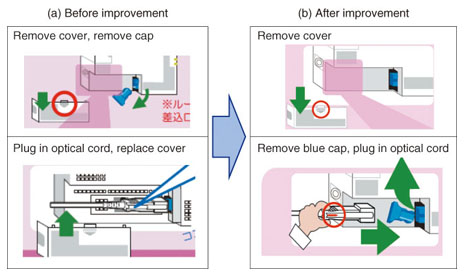
For example, Fig. 4(a) shows the figure used to illustrate the task of removing the cover and plugging in the optical cord in the trials. The cap should be removed before the optical cord is plugged in, but we observed quite a few users who did not follow these instructions. We observed that many tried to plug the optical cord in by pushing it into the cable compartment without removing the cap; this could damage the optical cable and will fail to achieve a good connection, but in the experiment, no one actually damaged the cable. We then came up with an improved illustration shown in Fig. 4(b) that gets users to follow the procedure by illustrating the procedures for removing the cover and plugging in the optical cord in a single figure. The main difference between (a) and (b) is that in (a) remove cover and remove cap are illustrated in one picture and plug in optical cord is illustrated in the second picture. On the other hand, in (b) remove cover is illustrated in one picture and remove cap and plug in optical cord are illustrated in the second picture. Our aim with the improved design (b) was to get users to realize that you cannot insert the optical cable until after the cap has been removed.
In addition, we further improved the ordered-layout manual, as shown in Fig. 5, by minimizing the amount of text and emphasizing the sequence numbers of the steps. Here, we took the minimalist approach [3] that is commonly used in software manuals. If you try to explain every conceivable function and operation in a software manual, you can end up with a manual as thick as a telephone book, so the minimalist approach offers a way to cut out a lot of inconsequential excess information. While the minimal software manual enables users to actively learn a wide range of functions and procedures, the simplified replacement manual (minimalistic manual) should help reduce the feeling of aversion toward this kind of task.
The effects of these proposed improvements are now being studied, but one thing is certain: good design requires considerable ingenuity so that users are guided to execute the actions intended by designers. 3. ConclusionIn order to design user-friendly easy-to-understand installation manuals, it is important to thoroughly understand the users. Yet no matter how well one tries to understand the people who will be using the manual, some of them will act in ways not anticipated by the designers or authors of the instructions, so coming up with the ultimate perfect design solution in one try is practically impossible. In order to develop well-designed installation manuals, we continue to make repeated incremental improvements while periodically assessing user responses. It is also necessary to sift through the content and determine what is truly important in terms of the task at hand. In the examples presented here, the duplicated-layout manual proved advantageous in that it enabled users to easily anticipate the overall task that needed to be done, but the ordered-layout manual proved better at getting users to follow the steps in the intended order. The designer should understand the advantages of each type and choose the layout according to the situation. At the ICT Design Center, we are striving to improve the quality of product manuals, equipment installation manuals, and other instructional materials through user observation and assessment. Building on what we have achieved so far, we will continue to collect data and best design practices necessary to create user-friendly easy-to-understand installation guides. References
|
|||||||||||


